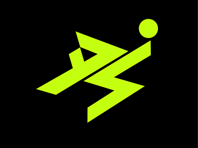
Dominik Szoboszlai Logo Exploration 26
A couple of years ago I pitched a brand identity for up and coming Hungarian player Dominik Szoboszlai that unfortunately got rejected but of all the logo marks I made this one was my favorite & I can finally share.
The logomark is made up of the player’s initials in a bicycle kick pose to represent his penchant for flair. The letterforms have hard angular edges to represent Domink’s speed and directness. Hyper yellow was chosen as the accent color to represent youth and energy.
See more on my blog: https://www.danielnyari.com/blog/2019/10/24/dominik-szoboszlai-logo
More by danielnyari View profile
Like
