eBite Logo
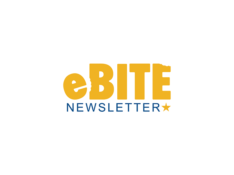


North Carolina Dental is a Sercante client who had recently started using Pardot. They have a newsletter called eBite that they wanted to be redesigned as part of the migration from Emma into Pardot.
The logo they were using wasn't very distinct, and there was nothing indicating what eBite actually meant. While it was very clear to the internal team eBite was the newsletter, it would be easy for recipients to not make the connection between the name eBite and being subscribed to a newsletter.
The intent of this logo was to bring some playful elements into their newsletter and clearly define their newsletter name as a newsletter.
