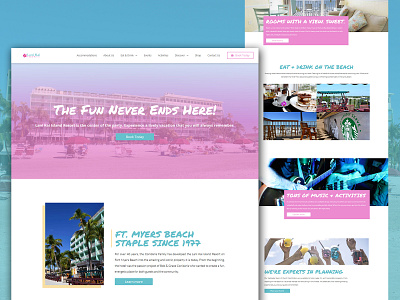
Lani Kai Island Resort
Lani Kai Island Resort
Visit Website: https://lanikaiislandresort.com/
(Note: The design of the website has slightly changed since it's redesign in September 2018)
--------------
The project was to redevelop the Lani Kai Island Resort website in order to achieve the following goals:
1. Drive more direct bookings
2. Bring user experience up to par with modern design trends
3. Create a design language that attracted their most profitable target audience; College students & Millennials.
Completely redesigning the website was a requirement. Every element from fonts and colors to content language and structure of pages needed to go through reconsideration and development to most effectively attract users. This massive undertaking would provide a clear, easy to navigate and visually unique website for the Lani Kai Island Resort to reach their target audience and gain more direct bookings.
In the redesign of the Lani Kai Island Resort website, I expanded and muted the color palette to give the resort look fun and lively without being too harsh. I made sure not to overuse the color and added more white-space to give the content breathing room.
The number of pages on the website dropped from an overwhelming 64 pages to an easier to manage 34 pages. With less repeating content, the Lani Kai is providing clear and concise information to its target demographic.
