Single Product
DailyUI challenge #12:
Single Product
Based on the designed I did for the Social Share, I expend the concept to match this challenge.
Thought Process:
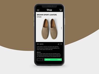
I decided to have a vertical slider for the product image because I thought scrolling is more adaptive experience for the majority of users than tapping on slider navigators. I placed the product details in the scrollable view, too. It would feel natural for the user to interact when we use the same behaviour for the scrolling of product image and description.
Then finishing up with sticky, bright green Add To Cart button. I think using green button over dark background would really stand out component. After all, the button is the most important component in the page and I think, making the user aware of that component is equally important.
Disclaimer: Product Image, Titles and Copywriting found in the image are from Zara. And I do not own any of those content.
