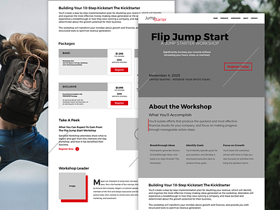
Workshop: Jump Starter - Diagonal
This is the high fidelity wireframe of a landing page created for a workshop. After opening up Sketch App and a few iterations, a website was born. Wanting to keep with the theme "Flip Jump Start" I decided to include embellishments throughout the site in the form of diagonal lines to add motion. And chose imagery that matched the theme. What do you think?
Hit "L" if you like it :)
Check out the other design iterations.
Kindly follow me for more design inspirations and stories!
P.S. follow more of my works on
📷 Instagram
🖋️ Medium
📢 Twitter
👍 Facebook
💼 LinkedIn
💻 GitHub
More by Katherine Delorme View profile
Like
