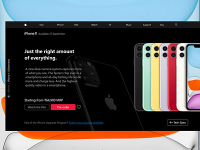
Concept design for iPhone 11 Landing Page
Hello Dribbblers,
I heard the big news few days ago like everyone.
"iPhone 11 series is released!!!"
I Googled to check the model and it's features, and the result came from the tech giants. As always, the first one was from Apple's website like 'the proud mother is here to tell about his newborn'.
Clicked and landed on iPhone 11 landing page. We all love Apple the company, their products, their design system and all about them. As I landed, I was welcomed with a big hero image of beautiful iPhone 11 back side in a stunning dark themed page. But I could only see a small portion of the image (the first camera, flash and half of center camera), not more than 1.5 inch of the phone in my 14 inch laptop screen. I'm using 1920 x 1080 resolution screen, which is currently the standard screen resolution for modern computing, and the most popular resolution for gamers.
I spend more than 7 minutes to check the preview and to read the important stuffs about the new model, I stayed because I want to find out how hard is that to get what I came for. The page was as long as early morning news feed of a Facebook account on Mondays, hard to find the features list, confusing color consistency for active and inactive buttons, a heap of unimportant content (at least not for who comes to see the first look of the product and have a peek at the product information like me) and also I couldn't find a call to action (CTA) button for pre-order or booking.
I was very disappointed and I was thinking about their position in design and tech world, and their investment for user experience design. I know, I am talking about the biggest fish in the ocean. But I am sure that even you will feel the same way I did, if you go through the process I explained in this description.
https://www.apple.com/in/iphone-11-pro/
(the above link is for those who wants to check)
I thought about it in an user experience designer mind and what about if I could find a better way to approach the users of this landing page like me with easiness, usability and accessibility.
I was frustrated as an user who comes to check about a product. I noted all the pain points I had, the problem I faced and barriers in that page. Also wrote the goal of that landing page, how to convert a looker to customer, created user persona (noted the pain points I faced), worked on the content(the information I was looking for when I googled it), the user flow diagram, features list, CTA button (pre-order), competitor analysis (Oneplus also about to launch '7T series' in this month, I found it nice and clean), did different sketches (pen and paper), wireframe and tested with a user (who is actually a friend of mine, interested in same product). Amended sketches and wireframe as per the result from user testing. Important points and sketch of interface.Then I decided to design the high-fidelity mock-ups and prototype it. Finally, I sat on my desk, in front of my laptop with sketches and opened the super easy and the beautiful design tool Adobe XD (Adobe Creative Cloud), I felt like I am a designer again. :D
This is my first UX project and it is not perfect, I did almost of the UX processes for this project as explained in this article. I really want to improve in my knowledge and experience.
