Case Study Responsive Hero Section
![Max Burnside [Available for projects]](https://cdn.dribbble.com/users/303299/avatars/small/5380070fabf4894e68c5de6113f868b0.png?1690152453)
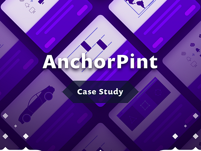
A little demo of the responsive hero section for the Case Study pages. Elements resize to not only fit the width of the viewport but the height as well.
A little demo of the responsive hero section for the Case Study pages. Elements resize to not only fit the width of the viewport but the height as well.