Check Out Form
DailyUI challenge #02:
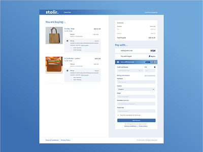
Checkout form imagined for an E-commerce store.
On the Menu bar, there is a page title, which indicates where a customer at. And an exit for the customer from the Check Out form just in case, if the customer changed his/her mind. Apart from that, I try to minimize the navigations to prevent the “leak” and improve the conversion rate of checking out.
On the payment, I imagined providing the options for major types of payment. And also previously saved payment, which allows the customer to quickly finish the check out process, without the needs of filling up so many information, every single time.
Overall, this is 02 of dailyUI and I use the same style and design language as 01 of my dailyUI which you can find in the following link.
