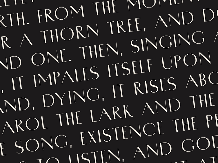
Porte Sans In Use
Logo design aside, Porte looks awesomely great when used in a text. Even the uppercase seems to remain legible at smaller weights. But of course it's up to you to decide if it's great or not!
Here's the original listing: https://crmrkt.com/Bkgeg2
More by Groteskly Yours Studio View profile
Like
