Domite Rebrand

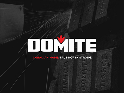


The goal of this logo rework was to natively integrate the Canadian maple leaf into a unique and memorable mark for Domite. To do this, I played with the negative space of the “M” and used the iconic peak of the Canadian flag’s maple leaf to center and ground the logo. For the typeface, I custom drew a font face that loosely resembles the type of font used for Captain America and other army applications. We modernized it for a custom feel, but it feels very strong due to its influences. The colour palette has remained the same with the update of the gradient being rendered “flat” for a more updated feel. The two shades of grey here represent the two metals that are cast together to create Domite.