Logo Design for Pubic Health Section of a University

The Need:
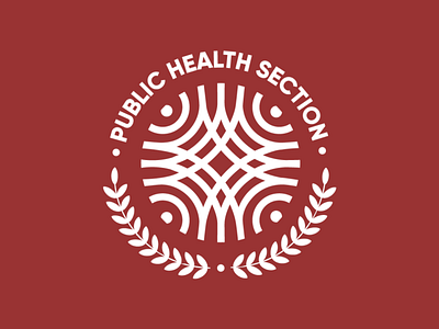
Public Health section of the karolinska institutet is a group of students, professors and healthcare enthusiasts who collaborate to bring ideas that change and improve the systems within healthcare. They required a logo that best represents their vision.
Logo Design:
Ideas are like ripples on water surfaces, once an idea is born and shared, it creates a ripple effect. Taking this as an inspiration the form of the logo was designed. Showing how many ideas come together. If seen closely, the form creates a globe as well as a cross.
The deep red was used for the brand. Red is the color associated with energy, power, determination as well as passion, desire, and love. Red is a very emotionally intense color. It enhances human metabolism and is used in the cross symbol.