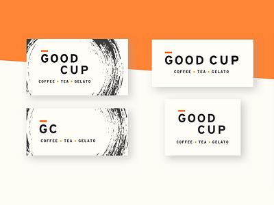
Good Cup branding
I rebranded a local, family-owned coffee shop called Good Cup. For the new visual identity, I chose a comforting, warm, energizing palette. To invite guests to stay awhile, I incorporated an accent shape that represents both a full cup of coffee and the liquid ring left behind on a coaster from a long-standing glass. The original Good Cup logo incorporates a halo, which I alluded to with the orange accent line in my designs. I used these new elements to inform the design of a new logo, merch, and menu.
More by Jordan Reese View profile
Like
