Windhammer Logo Comps
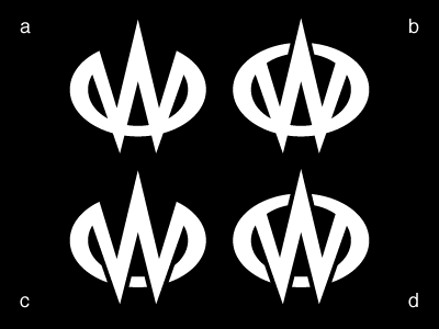
These are variations on a logo for my famed air guitar persona. I think it's close, but not quite there. I've spent a lot of time fussing with the stroke modulation to strike the right tone and balance, and it's time to step back and get some more eyes on it.
What I'm going for:
1. Menacing
2. Heavy metal and D&D (somewhere between vaguely and overtly)
Likes:
1. Good interplay of positive and negative space.
2. Doesn't immediately read as a W.
3. Sharp and stabby.
Dislikes:
1. Looks kind of like an automotive or super hero logo.
2. Still a bit whimsical.
At the moment I'm leaning in the direction of A or B. I'd love some feedback!