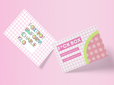
Business Cards
F-Box Part 2
The idea for this brand was for it to be an enjoyable, mysterious monthly subscription box in which you would receive a few random branded items playing around the NATO phonetic alphabet. This vibrant look was inspired by the brand itself, being energetic and whimsical. The colour pallet chosen represents a feeling of bliss which the brand wants the user to experience. Using the typography and the colours that were chosen for the brand we accentuated the original idea of happiness.
For any commercial work feel free to contact The Coup at:
[email protected]
✚ ✚ ✚
Subscribe to our mailing list on our website to keep in touch with The Coup.
✚ ✚ ✚
More by The Coup Designs View profile
Like
