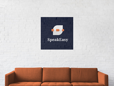
Speakeasy Logo
In designing the logo for SpeakEasy, an on-demand live interpretation startup, we wanted to avoid using a Latin character in combination with a character from an Eastern Asian script. The reason being that it's boring; most translation/interpretation services go that route. Secondly, SpeakEasy provides auditory services (interpretation) not written services (translation) and lastly, we wanted the logo to feel universal, something that can't be achieved by using 2 characters from 2 scripts.
SpeakEasy's logo takes inspiration from two concepts: conversation & transformation. The concept of conversation is visualized by an abstraction of "speech bubbles", while the concept of transformation is shaped by a square shape morphing into a circle, thus visualizing the role of the interpreter of transforming one language into an other.
