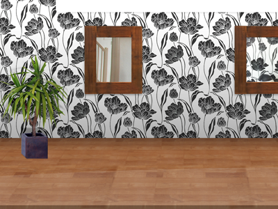
Hairs & Graces Early Footer
I'm currently working on a design for a hair salon (non-chain) and have been playing with this concept for ages. I finally got some time to refine my earlier work and I sort of like the way this has come out, however a part of me can't help thinking it's a little tacky. I really wanted to get away from the whole slightly gradiented backgound with subtle noise thats so common in the scene currently. I guess this sort of represents my design style too, since from very early on I often seem to try and recreate phyiscal environments. Now, whether that's because I don't have the talent to think up of something more abstract, or maybe it's just how my mind works ;).
Take a peek at the full design so far: http://cl.ly/3657b842128f7ce3a226
[b]Some context:[/b]
As I said, its for a small hair salon, run by a lady owner. It's about 10 years old and she recently had a revamp and now also offers beauty services from another woman (so sort of separate from the main business, but to the customer it's all part and parcel of the experience I guess). She's also looking into offering more services in the beauty area in the near(ish) future.
In action: http://cl.ly/a19a13e7dd6b5f49c03b
I plan on changing the image showcase section at the top, (the back/forward areas which don't have icons yet are too prominient for me currently - and i'm doubting the entire existance of the showcase piece for everything bar the homepage). I was also going to try and incorporate a pair of salon chairs under the mirrors along with the required basins, but I need to go and get some more photos for that. So basically, largest, least functional footer *EVER*? :|?
Not 100% with the plant, but its the best I could find. Perhaps i'll replace with a better one if I can get some more reference photos.
In the end, I guess this is still in the concept stage, but it's pretty far along. Just some doubts in my mind are causing me issues regaring the overall direction.
I'd love to know your thoughts and input so far ;).
