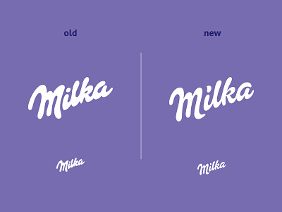
Milka ReDesign
Fan redesign of famous Milka logotype. I balanced the space between letters and also the consistency of the letterforms. Very important to me was how the logotype will look in small sizes, because the old one was not doing so well.
Hope you like it :)
More by Simeon Zhelev View profile
Like
