Trestle
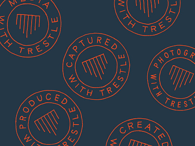
Late last year to early this year I had the opportunity to develop the identity for Trestle. I pushed myself to not only develop something that was purely the right aesthetic (raw, much like shooting with natural light) Stephen was going for, but also create some meaning behind the identity. We talked about how the name symbolizes the idea of connection and how that relates to a person or client who’s trying to tell a story and connect to an audience through video or photography. After staring at photos of train trestles at a million angles for a million minutes, the side view seemed to resonate with me. Many trestles connect from one mountain or hill to another, crossing valleys or streams. That idea of “connection” was brought to life in a simple symbol that forms an abstract train trestle, but also the letter T. Had a lot of fun digging out the sharpies and getting my hands dirty for this one.

