Fizz Society Logo Concepts

Exploring some early identity concepts for the sparkling wine subscription box service called Fizz Society.
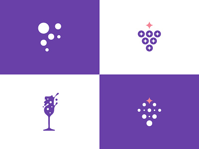
These are the concepts presented to the client.
V1 - based on the idea of sparkling bubbles, formed as the letter F (from Fizz)
V2 - sparklings combined with the grapessss, looks good to me as it is, but it may be a bit too much on the general wine side, not exclusively for the sparklings. Your thoughts?
V3 - probably my favorite, a bit more abstract version of the flute glass, created with bubbles and a bit of splash to resemble their friendly, fun and light-hearted side.
V4 - similar/same to the V2 idea, but different execution
The brand is more for the regular people, with a focus on young urban London ladies, 25-39y old.
After this, we are looking forward to working on the box packaging and the website as well :)
Looking forward to your feedback and appreciate that! Also, let me know if you've seen some of these concepts somewhere already. Thank you! :)