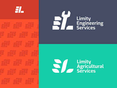
Limity Sub-branding
These two brands which were newly introduced under Limity mother brand. I tried a bit different method on this sub-branding project.
Based on the same logo form of the mother brand, each sub-brand designed with different metaphors.
Tool in hand - Limity Engineering Services ( 🔧+ ✊)
Ear of paddy - Limity Agricultural Services ( 🌾)
Unity made with same basic form and typography in both brands. What did you think about the approach?
More by Malan Alankara View profile
Like
