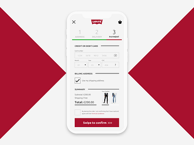
Levis Credit Card Checkout App Screen - Daily UI :: 002
A simplification UI design of the checkout page on Levi's website, that feels and behaves more like a native app.
To keep this Daily UI challenge easier I will just redesign the last thing I used that relates to the design hint, and the last time I had to fill out my credit card details was when buying jeans online.
More by Kieran James View profile
Like
