Helmut Lang Mobile Homepage Prototype 2
In my MA Final Project I worked on a concept for the rebranding of the fashion brand Helmut Lang. We did not deeply explore digital strategy so I am going back and considering how we would have conceptualised the Helmut Lang website, starting with the homepage.
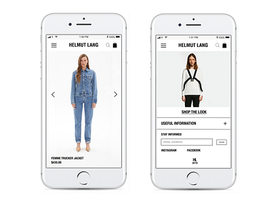
This wireframe shows the final iteration of the mobile Homepage following paper prototype and wireframe testing.
As with the desktop version, the idea is that the brand is minimalist and conceptual, with a key focus on seasonal Projects (or campaigns). In this iteration, I respond to wire frame testing.
I made the following changes:
-Users are not motivated to scroll while on mobile because they will usually be on-the-go or browsing with less attention, so the navigation menu is sticky.
-The font sizes were not uniform across the homepage so users found this distracting and were not sure about the information hierarchy. Therefore I made the font size uniform, with slightly smaller font where there was more wording (product names/ prices) and in the footer.
-The font size and elements in the footer are slightly bigger so they are readable and clickable without interference.
-It is important to have the "HL" icon at the bottom of the footer to avoid any clickable actions interfering with the browser viewing (see Safari/ iPhone browsers).
The campaign referenced in this concept is Re-Edition by Exactitudes® for Helmut Lang AW17/18.
Banner image: Chipo Mapondera with Helmut Lang advertising imagery from the 90s.
Campaign (model) images: Exactitudes®, a documentary photography project by Ari Versluis and Ellie Uyttenbroek (https://www.exactitudes.com/).
Other images: Helmut Lang website.
