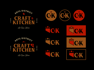
Craft & Kitchen Logo Lockup Ideas
After showing the original Local Kitchen lockup to the restaurant owner he asked to see it written as "Craft & Kitchen". While I couldn't quite get the letters to cooperate to form some fun ligatures (not quite yet at least) I decided to take a break from trying to fix it and began working with a minimal version of the state of Nevada. It's an interested mark, especially with the stars above it, but it's also not entirely clear that's what it's meant to represent. It looks more like a flag, tab, or guillotine blade (yeesh).
What do you think of these lockups?
--
Follow my work on Instagram @damngoodbrand
New clients are extremely limited and by referral only.
Say hi: [email protected]
More by James Viola View profile
Services by James Viola
Like

