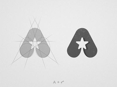
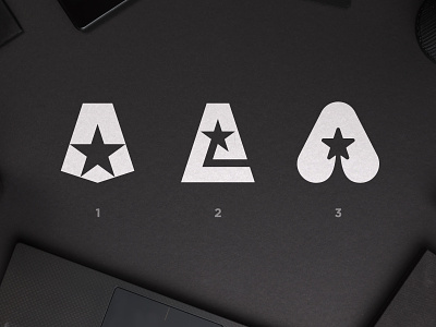
All Positive Energy - Logo Grid
If you are a Logo Designer there's something that will improve the value of your Logos by 10x and this mark perfectly exemplifies it. It was something i learned from a couple of years ago. And it is to ALWAYS make sure your logos work on black and white... You can add little shadows, textures, whatever you want, it will add to the design. But make sure it works on a single color.
Why? First because that's an easy way to make sure it's not over complicated and visually unbalanced. But also, on more practical terms, it's the only way to make sure it can be printed on a single color or even engraved on a surface.
I hope you make good use of this tip. Would you like me to give more tips on Logo Design? Let me know in the comments what you would like to know about 👇🏼

