Scoop
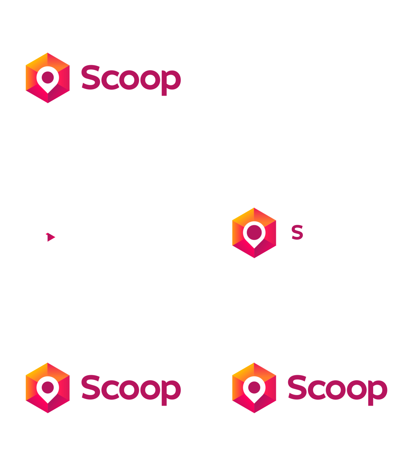
Approved logo for a webdesign agency based in Western Australia - they create and maintain websites, and most importantly help their clients be found more easily online.
The symbol was created using a hexagon as a three-dimensional pixel to convey the digital nature of the business. The pin marker was used as the core of the symbol to represent helping the customers' business be discovered or more easily found on the internet. The orange/red/purple color tones were used to make the symbol feel approachable as opposed to cold/corporate.
• Let's work together, contact me at [email protected]
More by Dalius Stuoka View profile
Like
