"Zuo" logo design
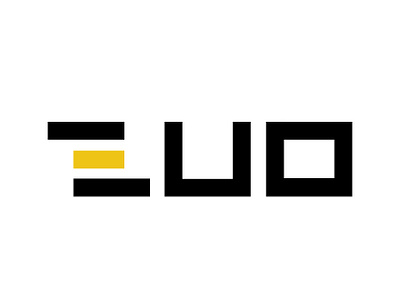
An insurance company named "ZUO" requested their logo to be: modern, striking and simple.They also requested yellow and black to be included in the logo.
I decided to make my own font (using a grid) and play with the letter "Z" a little, to make it more original. The logo represents stability with it's bold font (sign of security).
