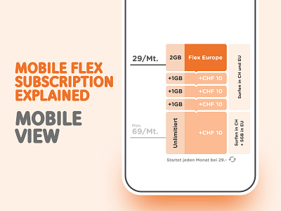
Mobile "Flexometer"
In this project, my 2 biggest challenges were how to show both parts included in the subscription (EU and CH) with data and price infos without overcomplicating the graphic and also, how to show that in the most optimised way for mobile. We decided to, contrary to what one would think, show the highest price on the bottom. Since the nature of a mobile page is to scroll down, the user should see first the basis price, and scrolling should review the "top-up" price.
More by Gabriela View profile
Like


