Idea Rocket Branding ID Concept
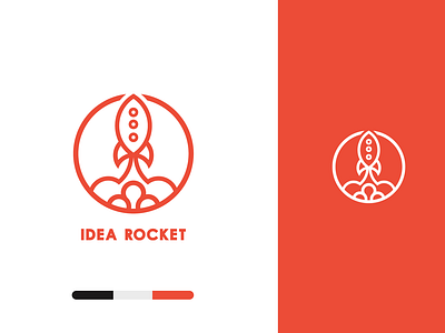
This is a combination mark logo concept for Idea Rocket.
⠀
This proposed concept is for a team of solution-based marketing officers focused on customer experience and leveraging communications for "out of this world" thinking and results.
⠀
I created this by combining a 🚀 +💡
⠀
In order to create a visually pleasing, balanced mark, I used the golden ratio to construct this logo.
⠀
The three keywords that I used as a roadmap for creating this identity were Mindful, Strategic and empowering.
⠀
By experimenting with the placement of contrasting sized circular elements, I was able to create a mark that is easy to identify and work as a scalable system.
⠀
Since the logo works in one color, it’s a more mindful approach for going to market.
⠀
The typeface Soloman Sans was used to compliment the pictorial mark because of its excellent legibility and optimized kerning that makes it easy to read and identify.
⠀
Overall, this identity system offers a simple, bold and easily identifiable solution that is positioned to create brand awareness and drive results for the brand.
