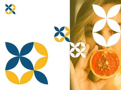
Brand Icon
Single image for brand presentation. Brand is a heavily female focused Canadian cannabis company. Project was to create an identity that was heavily outside typical cannabis brands in colour usage, look, feel, and market segment. Many cannabis brands are heavily male focused, or ambiguous in nature or more lifestyle based. Goal was to convey Cannabis is acceptable to be used by women, and the company promotes inclusiveness as anyone can use the product, but is typically geared towards the vastly underserved female market. The project entailed bright and optimistic design, featuring content that has relatable people, images, and messaging in various social channels, web, and external marketing.
Considerations/Challenges: Cannabis marketing and branding was subjected to various heavy handed marketing and packaging guidelines by Health Canada, which changed heavily throughout the creative and design process. Minor details like showing emotions, particular lifestyles (athletics, outdoors, etc.), and at one point colours were restricted in ever changing guidelines.
Agency: DiGA Client: Kanabe Creative Direction: Self Art Direction: Self Photography and styling: Lux Visual Design: Self Social strategy: Lux / DiGA Content strategy: Client / DiGA / Lux
Live project and brand, not a concept project.
