Onboarding screens
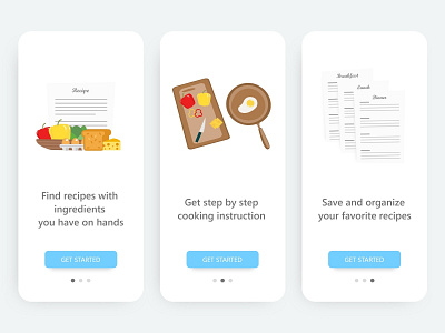
An onboarding design concept for a recipe app. - My goal to present the top user benefits with simple visuals and text to convey the concept. I followed the material design top user onboarding guide. - From the research, I decided to go with 3 screens with the core value provided by the app. I tried to keep the design simple with a clear call to action button. It's better to choose an auto-sliding carousel on top benefits onboarding model with GET STARTED action button that loop through the animation continuously until it gets tapped. - Feedback is always appreciated!
More by sai krishna View profile
Like
