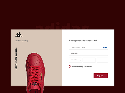
Adidas Checkout Concept - Daily UI Challenge #002
As part of our daily design challenge, we have come up with a checkout concept for single page checkout by using @adidas style.
We tried to be minimal as well as colorful with this design. As usual, we don't just design is for the sake of prettiness but also we keep user experience on our mind.
Show us some love by pressing L, or double tap on the photo, Comment if you want to improve the design.
If you've a great idea or need help with design shot us an email at [email protected] or send us a DM.
More by MOTIF® View profile
Like
