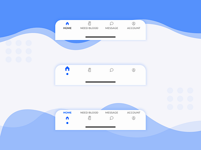
Donor App | Bottom Navigation Concepts
In the above shot, there are three designs for the bottom navigation of the app. Each design is only slightly different from one another and only these slight differences are the ones that make one design work better than the others.
Which one do you like? Let me know in the comments ---------
Icons by @becris from @nounproject
---------- Find me on : Instagram: https://www.instagram.com/uxandmore Behance: https://www.behance.net/hellomanav ---------- LinkedIn: https://www.linkedin.com/in/manav-madaan-25b44b114/ ----------
Looking for a Designer, Drop an email @ [email protected]
----------
Still Reading! Here a joke for you: Comic Sans walks into a bar. The Bartender says we don't serve your type here. :P
---------- Hit that Follow button dude. C'mon! 🦄
----------
That's All Folks!
