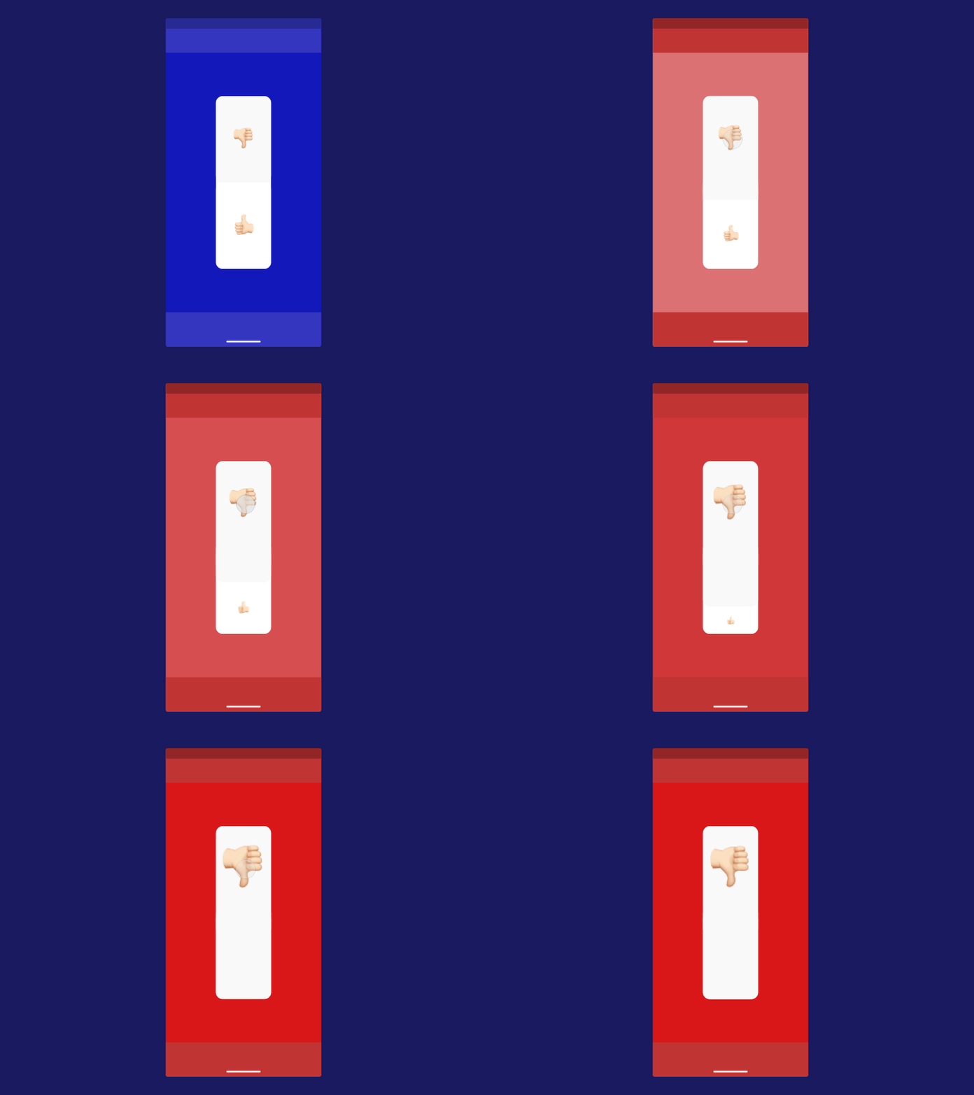
Like/Dislike Design Interaction | ( 3/3 )
Above interaction is the design experiment to modify and the star, points or rating based reviews. The idea behind the concept is we always map or take feedback on how good or positive the experience was but never measure the worst experience. Making an interaction like this may help us gauge the the degree of bad experience of the user. Such emotional responses are very helpful in empathising with the user and their bad experience. It was a fun little project making this interaction.
What do you think? Let me know in the comments.
----------
My Other Interaction Design Shots:
https://dribbble.com/shots/5881956-Reports-App-Sign-Up-Page-Prototype
---------- Find me on : Instagram: https://www.instagram.com/uxandmore Behance: https://www.behance.net/hellomanav ---------- LinkedIn: https://www.linkedin.com/in/manav-madaan-25b44b114/ ----------
Looking for a Designer, Drop an email @ [email protected]
----------
Still Reading! Looks like you're very "FONT" of me. :P
---------- Hit that Follow button dude. C'mon! 🦄
----------
That's All Folks!
