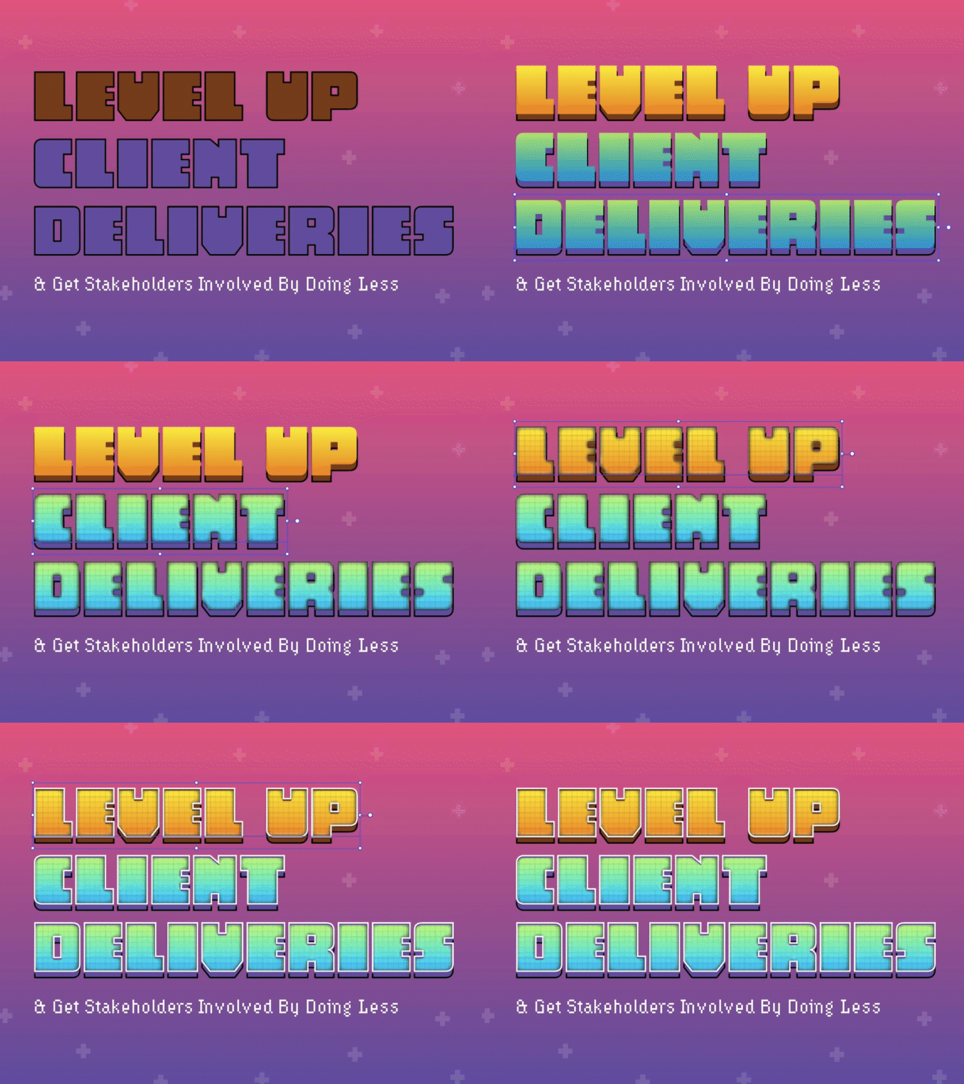
Layer Breakdown of Level Up Card for blog post
Layer breakdown of how I created the Level Up image for a blog post I wrote recently.
Typefaces used include Chuck and Hydrophilia Iced from Adobe Fonts.
In Illustrator after finding the fonts and layout I wanted, I made the base layer of the font (the shadow). Then I added the gradient fill and added the patchwork effect, then I gave it an inner glow. Followed by another dark outline. Lastly, I added a white stroke around everything to finish it off.
The blog post is about how to Level up your client deliveries when you don't have direct contact with your clients/their stakeholders.
You can read it here: https://link.medium.com/a87ILh2YsU
More by Chris Kohanik View profile
Like
