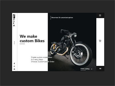
Foreo Header - XCard 4
Thought: Z-Pattern
Alignment, repetition, and contrast The user gets a clear message on what this page does "make custom bikes". Less content but more cues. clear actions to make the user trust to proceed further.
Critique: Logo and subtext could have been improved. lacks clarity.
FYI: The Bike image is from Unsplash. :)
More by Khan Mohsin View profile
Like
