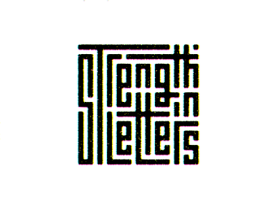
Strength in Letters
design
goodtype
grain
handlettering
india
interlocking
kerning
lettering
maze
mosaic
noise
offset
puzzle
quote
strengthinletters
texture
typography
View all tags
Posted on
Jan 29, 2019
More by Anvesh Dunna View profile
Like

