FSF Hotel Branding
FSF Hotel Branding
Full project can be found on my Behance
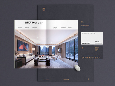
Four Season Fairyland Hotel is located in south China, surrounded by beautiful natural views along the Li River.
Designed with local nature, culture and artistic conception in mind.
We aim to create a brand image that makes hotel guests feel like being at home. So we started from the initials of the hotel, then combined the shape of the Chinese character “回” (means Return),
in this context, it means Be Home.
Considering the hotel’s unique Chinese style construction structure, we also bring in the concept of Wood Joints, which indicates every part of the hotel is organized perfectly.
Thank you