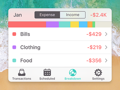
Simplified Savings 2 for iOS interface
It's always nice to distill the chrome of an app to a 400x300 tile like this. This simplified shot demonstrates the iOS interface for the Breakdown view in Savings 2.
More by Chris Sealey View profile
Like
