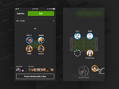
Dark UI of Foosapp
Are you ready to start the match? ⚽️A redesigned UI showing game lobby, invited players and their position at the table. We've decided to use dark UI during the match so players will not be blinded by the bright display.
👉 Visit foosapp.eu for more info. 👉 Full case study for more info.
Don't forget to leave a like (press “L”) ❤️. We would like to hear your feedback as well 💬.
More by nextap solutions View profile
Like
