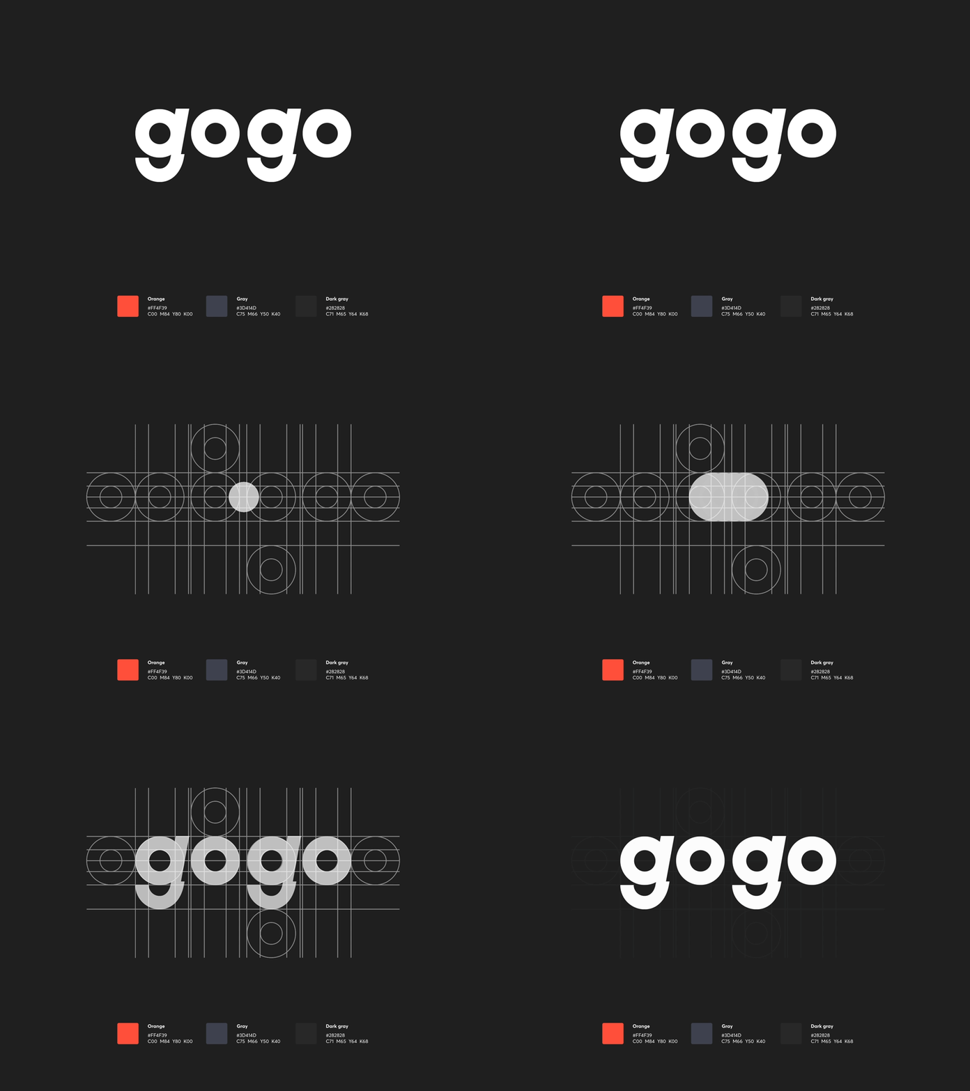
GogoApps Rebranding
Hey! 👋
How do you like our new branding?
We’re going for a modern, dynamic style to express our young and driven team.
As GogoApps grows, we’re focusing on things that make us who we are. Our name symbolizes the enthusiasm that keeps us going even on frigid Monday mornings!
This is why we’re changing our brand color to a vibrant shade of orange - bristling with youthful energy.
The wheel motif in our logo is a universal symbol of speed, moving forward, perfection and clarity. But for us, it also carries something personal - a reference to our design philosophy of starting with small things - “atoms” - and using them to create complex forms.
Want to know more? See the full case study on our Behance: https://www.behance.net/gallery/72805159/GogoApps-Rebranding
Cheers! 🔥


