Red Machine
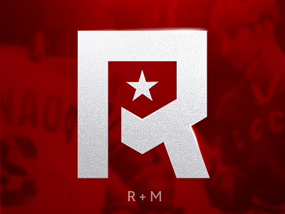
Monogram R + M. Red Machine logo rebranding. The old logo has a complex dynamics and a large availability of parts. I made it easier, a single memorable symbol, in this case - a monogram. So that first of all he could embroider and bake even in small sizes. In turn, it turned out to reflect the stamina and power of the Soviet hockey team.
More by sontwerper View profile
Like
