GTD Concept

I've always been a Wunderlist fan. Love its simplicity and well balanced UI Design. When Microsoft launched ToDo, they changed the design radically.
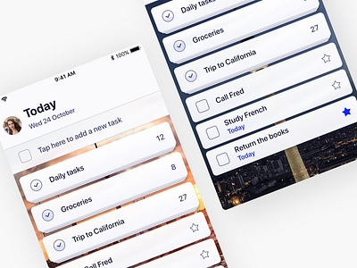
Here's an experiment I made, trying to combine the excellence of Wunderlist into the ToDo style.
Ended up way more Wunderlist(ish).
On top of that, I added a few things to this concept:
Stacked tasks (the icon shows the overall progress of the stack, very subtly)
Minimalistic UI (Avatar triggers the menu).