Sonos - Ui Challenge - Redesign


This week I’ve chosen to redesign Sonos's Mac app. I use this mac app quite a bit at home and always thought that the UI UX could be improved. I've attached the original for reference.
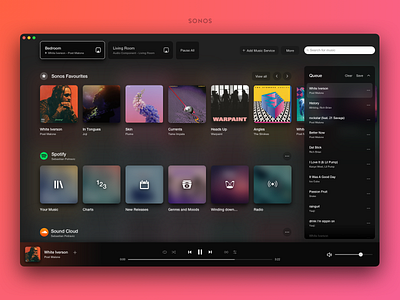
Currently the Sonos Mac app divides each of the different sections in to areas that are roughly the same size. I didn't think that the rooms section needed to take up so much space as the amount of rooms will likely not be large. I put the rooms right at the top, this makes sense hierarchically as everything below is related to that specific room. I thought the Select Music section could take up most of the space as this was the area that I used the most. I put the music controls at the bottom (Similar to Spotify) as this is more common UI pattern and made space for the rooms section. The queue now can take up a bit more vertical space and can still be collapsed.
In terms of visuals, I thought the current visual design was lacking a bit. Sonos's design really modern when it comes to their products and branding. The products themselves are very sleek and modern so I tried to also capture this in the UI.
Let me know what you think!