Personal Budget Report


This was a very preliminary design with nothing beyond the report that I did as a project to display someone's personal budget. Now that I'm looking at this again, I do think that perhaps the 4 cards at the bottom could be worded better and instead of using the term "budget" I'm thinking income or funds might be more suitable given how it's being displayed.
The navigation items were pages I thought might compliment a budgeting tool, but I hadn't thought beyond that for this particular mockup.
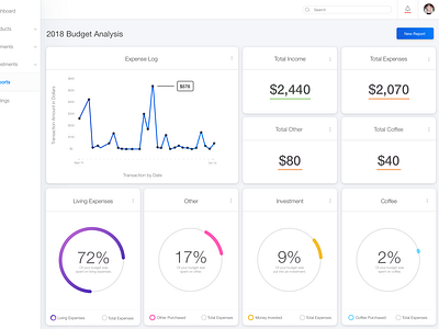
In this project I had looked into different ways to display data and what might be important to see with a personal budget. The idea would be that as you create your report you're choosing what type of information you want to see based on whats important for you to achieve your goals. In this example, the user would have selected a date range (Sept 14th 2018 - October 14th 2018 was the duration of my budget project) and then run the report so all of the information is based on that time span.
I considered being able to see information at a glance such that if you were to have this information come up on an apple watch or mobile application, there is at a glance information. On the desktop app you'd be able to drill down into the information by selecting the three dots, this could show you details and specific data such as precise dates and items that you've bought or what exactly the expense was that you've paid. If you hover data points like on the first chart, this will show you the total spent that day.
I incorporated a search functionality at the top so that you're able to quickly access perhaps reports or even statements that you may have on here under, lets say, payments. You'd be able to select "New Report" at any time no matter what report you're viewing so that you're able to create a report based on specific needs you have.
I did include notifications incase you've set up specific alerts to alert you when you've reached a goal, or you have data that is extremely different than what usually is flowing through your account and this could be anything, from a large purchase that significantly increases your other purchases to income being significantly less one month, that would help for you to generate reports to understand more details about that month.
I included a dark mode for the sake of dark mode. I did a bit of research on dark modes and I thought it was interesting. There isn't a true need for dark mode on this project I just wanted to see how elements and colors would translate in dark mode, but there wouldn't be a real need for one to access dark mode given the use of this dashboard would primarily be during the day and not every day, just certain days to regroup and see how you're doing financially. (This is an assumption, because I haven't done thorough research haha since it's a project.) I found that if you're going to have a dark mode, it's important to choose branding colors that will work well with dark mode.
Any and all feed back is welcome, honestly first time designing a dashboard and reporting page - still learning layout, and data visualization, and of course the importance of what the data means to a person and not putting a % for the sake of a %. Meaningful data is meaningful.