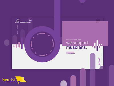
Website layout for a music-oriented marketing group
To design a logo, one must first design everything the logo will be on...Or so we think, anyway.
Story time: We were tasked with designing a logo for a marketing agency that specifically supported Australian musicians.
The logo had to be destroyable - smashed to pieces, and still recognisable. To get an idea for how to design a logo that could be taken apart - smashed - and applied in various shapes, sizes, and so on, we needed to establish some kind of visual theme for the brand that was consistent, malleable, reusable, recognisable, and memorable.
So, we picked a website layout as our canvas, and explored all the various symbols we could use to represent the client's business. This here is one of the designs we came up with during our exploration.
What do you think?
Send us some love <3:
hello@heurist.com.au | our website | our Facebook | our Twitter
