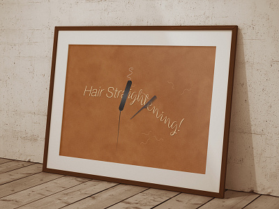
Hair Straightening | Typographical Poster
This project that began in late July was based around the idea of designing a typographical poster that would help visually communicate the act of straightening one’s hair, by the way of incorporating the title words as the sole signifier of the actual hair itself, with the inclusion of two separate styled fonts (one serif and the other being sans-serif) as a way of presenting a before-and-after state of the overall styling process.
To see the full project, be sure to head over to my Behance blog :)
More by Karl Bembridge View profile
Like
