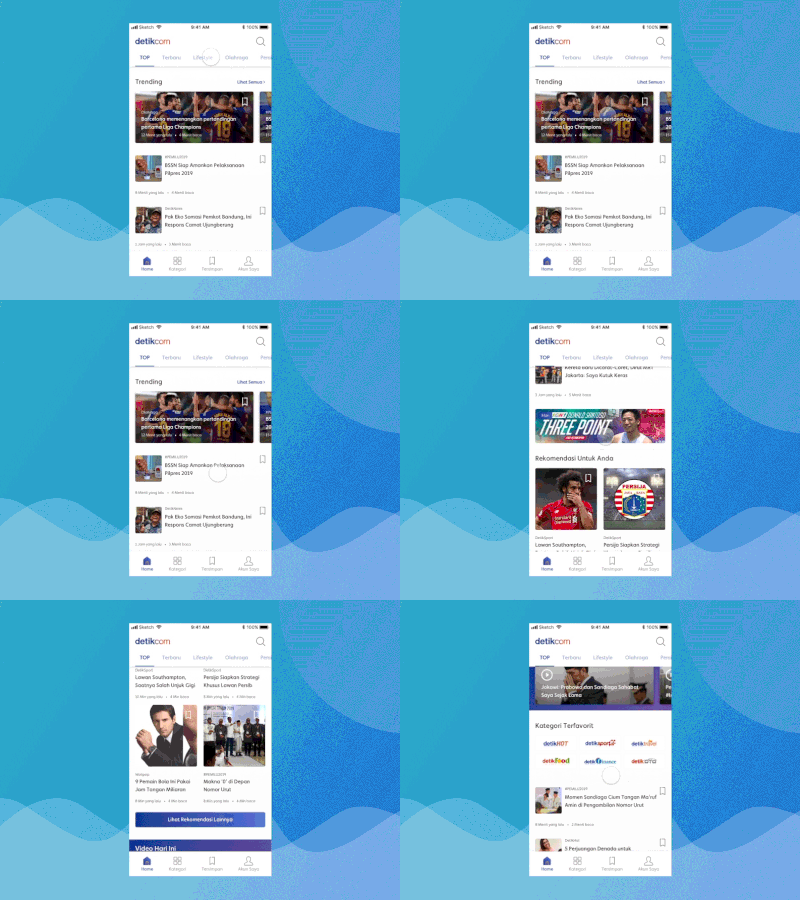
Improving Detik.com Homepage
To realize my resolution, I’ve been getting used to reading anything every morning and before bedtime. The article can be about product design, productivity, leadership or even news.
My fav reading apps are Medium and Techinasia. But I try to read news for the last month and I’m using Detik.com and CNN Indonesia.
However, everytime using detik.com I always confused to choose the trending news or what happens in this day. I felt lost. I tried to find what’s wrong and also tried to create a solution for my nuisance.
Curious about the results? Go to https://medium.com/better-experience-design/improving-detik-com-apps-news-list-a-ux-case-study-942f5ec2564f
Disclaimer: I do not work for Detik.com, nor am I affiliated with. I did this UX case study as I am a product designer who likes to solve problems and to improve my skills.
Thanks,


