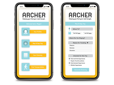
Archer App Approach #2
For my 400-level graphics class we had to design 3 sets of 5 icons and 2 screens for each set for an app that was assigned to us. My app was a travel app called Archer. I took it with the idea that it would be a "virtual concierge." You put in your interests and reason for traveling and it will curate an itinerary of experiences for you in the city you are traveling to. This approach for Archer shows a home screen and the "plan a new trip" screen.
More by Megan Hillier View profile
Like
