Soap Buttons

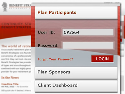
On a redesign for a financial strategy firm, we've put the login system front and center, based on the analytics of what the firm's returning web users are actually using the site for*.
We wanted to keep a clean and simple interface and style fo the site and transferred this to the login form. The buttons have an interesting perspective, one that is pretty hard to get to look right on a baseline grid. Probably will tweak this a bit in the code to get it to stand right, but I think generally it looks good. Any thoughts?
* The form(s) is attached to three separate (off-site) systems, so there can't be any sharing of the authentication without serious security implications. However, all of the firm's clients have experience with their designation, so there is rarely any instances of confusion (amazing, right?)