Netflix UI & UX Redesign Concept
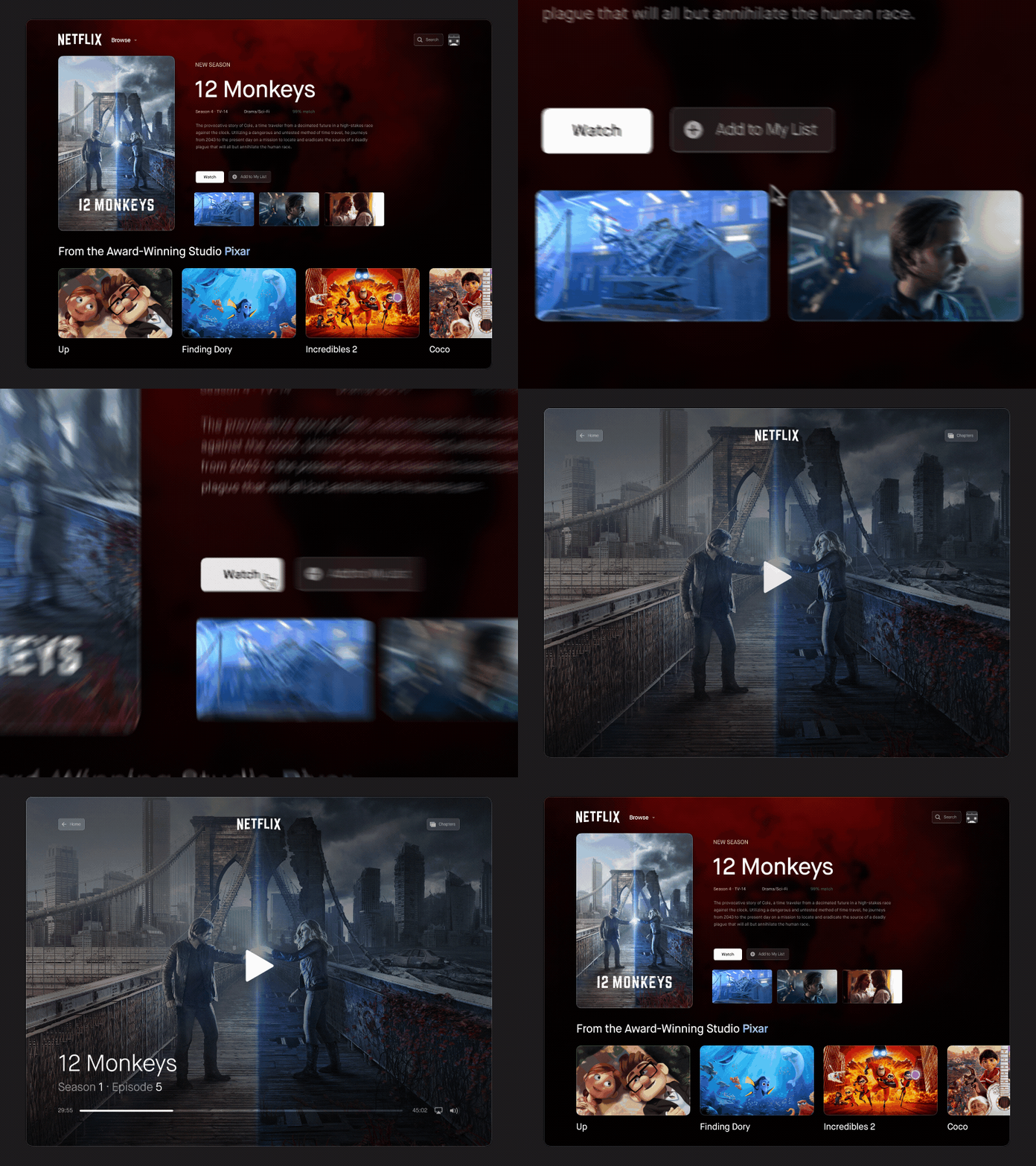
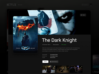
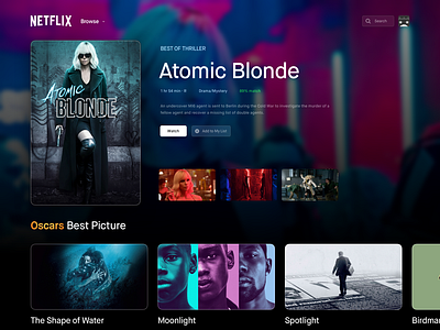
Netflix is known for their huge library with over 5,000 titles, but that's also their biggest flaw. There are simply too many options to pick from and I often find myself spending more time picking something to watch rather than watching. So in this redesign, there’s a new section that shows you one item only, and it only refreshes every 3 hours. Highlighting items like this will aid the user’s decision-making process and allow users to discover even more titles.
A redesign concept for Uplabs Challenge.
Learn More
I’m currently available for your upcoming project. Get in touch: [email protected]
More by Anh Nguyen View profile
Like


